Legacy Redesign
Modernizing a Mission-Critical Tanker Planning Tool
Lead Product Designer | U.S. Air Force | May 2022- June 2023
Note: This case study has been sanitized to remove sensitive information, with select details and images blurred or redacted in accordance with security requirements.
Mission 🎯
Redesign an outdated tanker planning tool to eliminate double entry, reduce data errors, and enable seamless integration with the Air Force’s suite of applications — all while modernizing the UI and improving flexibility for planners.
Scope: End-to-end redesign of a legacy tanker planner app, enabling integration with the larger suite, eliminating redundancy, and improving usability.
Challenge
- Legacy tool lacked integration → forced “bridge app” workaround
- Double entry errors caused delays & inaccuracies in tanker data
- UI was outdated, inconsistent with suite, and limited planning visibility
- Tight delivery deadlines + technical debt from rebuild effort
Approach
- Rebuilt the tool with modern architecture for integration
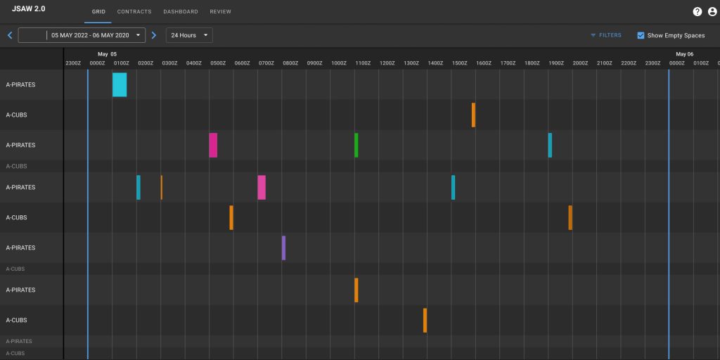
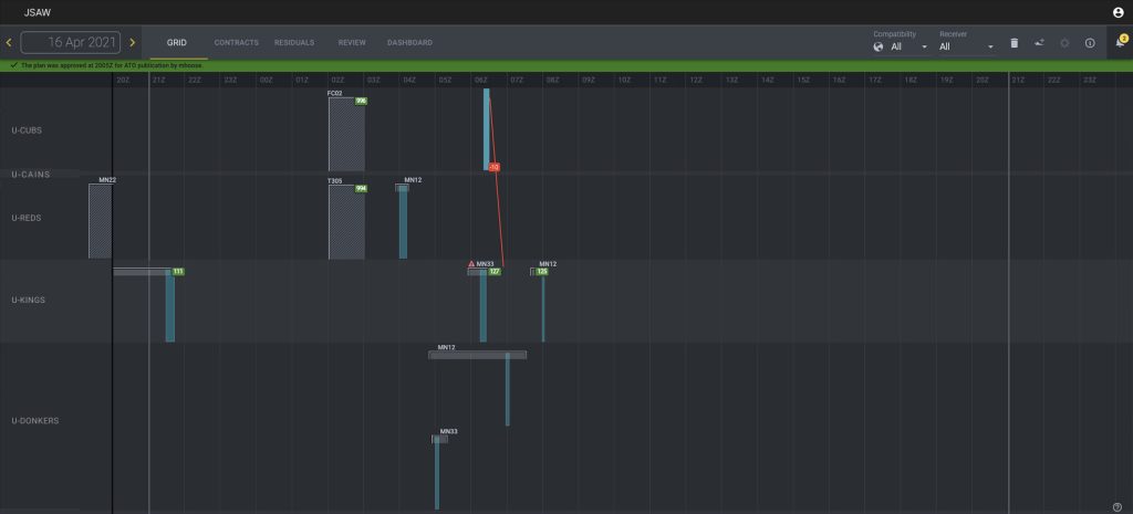
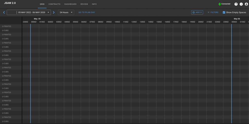
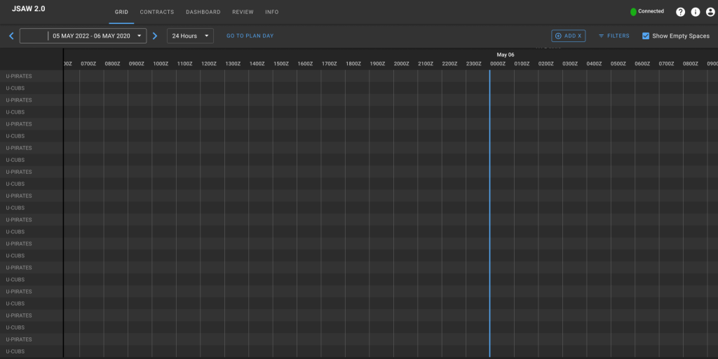
Iterated on timeline views (narrow/medium/expanded) for flexible planning - Introduced filters & scrolling capability to reduce clutter and allow future/past visibility
- Facilitated event storms, service maps, A/B testing to validate workflows
- Delivered multiple prototypes, refined through direct user feedback
Impact
- Delivered integrated tanker planning app aligned with suite design system
- Reduced redundant data entry → improved accuracy of final ATO deliverables
- Expanded timeline views enabled planners to plan ahead & cross midnight missions
- Established UI patterns that support future features like route displays & ground refueling

Reflection
Wins: Delivered a modernized, integrated tool with flexible planning features; improved accuracy and efficiency.
Challenges: Sensitivity of scrolling/zoom controls, out-of-the-box component limitations, overtime needed to hit deadlines.
Next Time: Push leadership for clearer long-term product vision before launch to avoid premature rebuild and mounting technical debt.
Learn More
Diving into the details....
Legacy Redesign
Outcome
- Deliver a new tanker planner application that enables tanker plans to be created and that is integrated with a suite of applications
- Enable the flow of tanker data to downstream systems and final deliverables
- Improve data accuracy to final deliverables
Scope
Produce End-to-end continuous UX Product Design delivery. Deliver a redesign tanker planner application that supports suit integration.
Agency & Users
Tanker Planner U.S. Air Force Air Combat Command
Duration
May 2022 – June 2023
Product Team
1 Project Manager
10 Engineers
1 Product Designer
My Role: Lead Product Designer
Mission & Challenges
Operational Problem
Airmen faced significant inefficiencies and risks when working with the legacy tanker planning tool. Because it was not integrated with the broader suite, planners were forced to “double-thump” data into a separate bridge application to submit official plans — a manual process prone to errors and lost time. The outdated codebase introduced frequent bugs, while recurring fixes often jeopardized the ability to deliver plans on time. In addition, the interface design constrained the workflow: planners could not easily view past and future plans in one place, the daily planning view was too narrow for flexible oversight, and the overall UI felt outdated and inconsistent with the rest of the suite. Together, these issues increased the risk of data errors, added unnecessary time to already compressed planning cycles, and created confusion for users navigating between systems.
Why it mattered
Data discrepancies from double-thumping frequently caused delays and inconsistencies across the system, undermining the accuracy of tanker plans. Manual adjustments added unnecessary risk and worked against the goal of an integrated suite. Planners also needed flexibility to work beyond a single planning day, both to anticipate future requirements and to reference past plans, which the legacy system did not support.
Success Criteria
- Tanker Planners can complete equivalent tanker planning capabilities to that of the legacy application
- Seamless data flow of tanker data between applications
- Accurate tanker data can be approved for the Air Tasking Order
- Planners no longer need to enter data into the bridge application
Constraints
- The introduction of new capability and features that impact backend changes should not be prioritized for the initial release
- Classified data
Discovery Research
Approach
Balancing Technical Modernization with User-Centered Design to Rebuild a Trusted Tool
Since this effort was a rebuild of an existing application, our discovery work focused on validating known pain points and ensuring the redesign addressed both technical and user needs. We drew on years of prior user feedback and research to guide improvements, while collaborating with product and engineering through event storms, Boris diagrams, and service maps to confirm that backend changes would enable integration without disrupting critical front-end functionality. It was essential that the new application retained existing capabilities while resolving issues caused by outdated code and technical debt. From a design perspective, we concentrated on incremental but meaningful improvements—expanding the planning view window, introducing filters, and eliminating redundant data entry forms that were no longer necessary with suite integration. We looked to timeline-based delivery applications for inspiration and explored different workflow options through process and service mapping to simplify user interactions. Multiple mockups and prototypes were created, then iteratively tested with users through A/B testing, allowing us to evaluate the value of different views and filters, refine the workflow, and ultimately identify a UI approach that met planners’ needs.
Insights
Challenges
- A scrolling capability allowed the users to see into the past and future quickly, tabbing to a new page was too much back and forth
- Filters allowed the user to get rid of content they didn’t need to see and or focus on specific parts of the plan
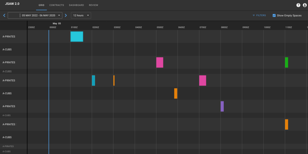
- Having a narrow medium and large viewing window allows the user to zoom in better over a shorter period of time and zoom out to see the big picture
- Users didn’t really need to see more than 48 hour out so doing a more expanded view was not necessary. The narrowest window that users needed to see was 6 hours
- Have a partial view into yesterday or tomorrow was helpful for seeing missions that crossed the midnight mark
- Finding the right component or widget off the shelf that provided enough flexibility to generate the viewing windows *essentially depending on what the engineers chose it might limit how the user navigated the space
- Availability of airmen for user testing
- Scrolling capability all though useful was also too sensitive so it was easy for the user to lose their place
Problem Framing
Problem Statement
Airmen struggled with inefficiencies and errors in the legacy tanker planning tool, which lacked integration, required duplicate data entry, and suffered from frequent bugs and outdated UI—slowing planning cycles and undermining mission readiness.
– “The legacy tanker planning tool slowed execution with duplicate data entry, frequent bugs, and an outdated UI.” –
Core Jobs To Be Done Use Cases
Primary User
- Tanker Planner (Tanker Pilots)
- Create and submit tanker plans for ATO approval
- Fulfill fuel requests for assets as par of the tanker plan
Design Objectives
- Introduce a flexible timeline for viewing fuel requests and creating tanker missions
- Introduce filters to reduce clutter to the viewing space
- Exclude redundant form fields (no longer be needed once the integration is complete)
- Utilize the current design system and known interactions Update the UI to match the current design system and trends
- Re-introduce form & from fields to capture fuel request data (Indicate mission information and fuel amounts)
- Re-introduce fuel requests to be displayed in the viewing window
- Re-introduce fuel indicators to display amounts and calculations
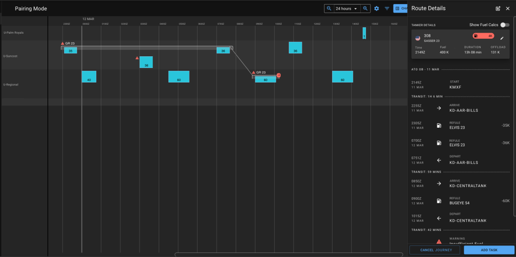
- Re-introduce fuel calcs and subway map route displays
Design Strategy & Exploration
UI Designs
Users struggled with a fragmented legacy tanker tool that made planning missions and tracking fuel requests cumbersome. I redesigned the interface with a flexible timeline, clutter-reducing filters, and re-introduced forms, fuel indicators, calculations, and subway-style route displays—all within the updated design system. The rebuild streamlined workflows, improved data integration, and gave operators a clear, efficient, and modern interface to plan and execute tanker missions with confidence.
Design Contribution &
Collaboration
Design
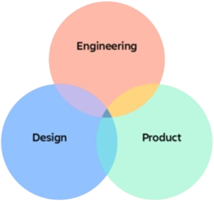
- Led UX strategy and stakeholder alignment
- Delivered a high-fidelity UI
- Facilitated async user engagement and continual engagement
Collaboration
- Worked directly with the airmen on a biweekly cadence to receive feedback, conduct prototype tests and determine adoption requirements
- Worked with product and engineering to determine user stories and deliver the product
Reflections
Outcomes &
Reflection
What worked
- Delivered an improved front end UI
- Delivered an expanded viewing window for the users with more flexibility for planning
- Enabled initial phases for fuel cals and a more interactive route display to allow for future feature capability like ground refuelings
- Enabled the delivery of a clean tanker plan to the ATO
Challenges
- Rebuild took time
- Limitations to out of the box components
- Sensitivity to zooming and scrolling across the timeline (decided to do pre-set zooms to mitigate accidental pinch zoom and scrolls
- The deadline for delivery was a stretch lots of overtime was expended in order to deliver the bridge app product on time
- Technical debt was generated which added to delays in delivering the actual rebuild app
What we would do different
- Start the rebuild sooner to reduce reliance on temporary fixes and throwaway work.
- Push for earlier identification of component limitations to avoid redesign churn.
- Explore more flexible interaction patterns for zoom and scroll to balance control with usability.
- Align delivery milestones more realistically to prevent burnout and reduce reliance on overtime.
- Proactively address technical debt during development to minimize delays in future releases.
Leadership Insight
- Ensure alignment on long-term strategy, technical constraints, and delivery expectations early on to protect team health and set the product up for sustainable success.