Lead UX Designer | Dana-Farber | Nov 2018- Feb 2019
Note: This case study has been sanitized to remove sensitive information, with select details and images blurred or redacted in accordance with security requirements.
Mission 🎯
Redesign an outdated oncology research tool to make it intuitive and efficient for oncologists and researchers documenting and tracking studies—reducing cognitive load and improving data accuracy.
Scope: End-to-end UX design from discovery through delivery. Modernized a complex research documentation tool to improve usability, navigation, and data clarity across researcher workflows.
Challenge
Legacy tool was unintuitive with redundant navigation and visual clutter
Limited user access early in the project
Conflicting stakeholder priorities
Short timeline to research, design, and validate concepts
Approach
Conducted contextual inquiries and stakeholder interviews across 6 user groups
Reviewed existing research and mapped workflows & system data flows
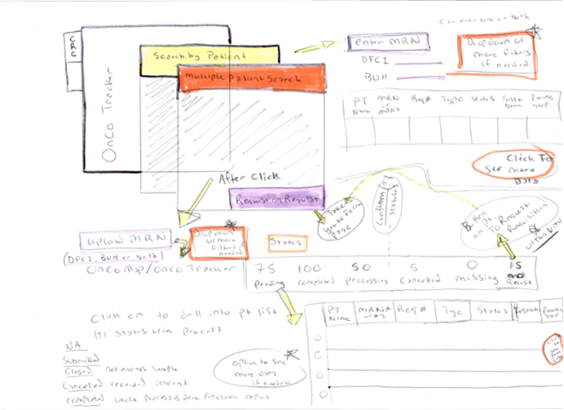
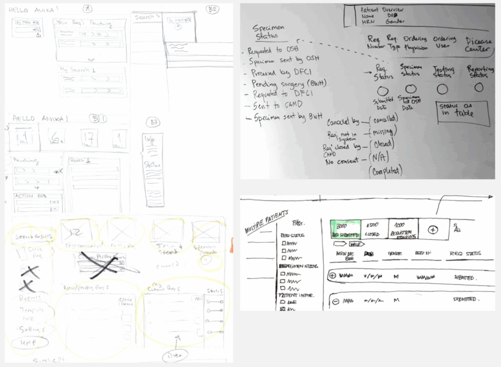
Sketched process flows to align user needs with technical constraints
Collaborated with engineering to ensure design feasibility
Validated early concepts through user testing and iterative refinement
Impact
Improved usability and reduced learning curves
Streamlined workflows and modernized UI using a design system
Reorganized navigation and content hierarchy to reduce visual clutter
Enabled faster task completion and more accurate research tracking
Reflection
Wins: Simplified complex workflows and created opportunities for ongoing user feedback. Challenges: Limited early access to key user groups led to assumptions that required later rework. Next Time: Engage all user groups earlier and introduce asynchronous feedback methods to capture broader input.
Learn More
Diving into the details....
Rebuilding a Legacy Cancer Research Platform
Outcome
Improve the usability of the application & reducing learning curves
Modernize the look and feel of the application by leveraging a design system
Improve efficiency by streamlining user workflows
Improve navigation and context
prioritize content & group items to reduce visual clutter
Scope
Produce End-to-end UX Design from discovery to product delivery & the continuation of feature development
Agency & Users
Oncologist and Researchers at the hospital
Duration
November 2018- June 2019
Research Team
1 UX Designer 1 Project Owner
6 Engineers My Role: Lead UX Researcher
Mission & Challenges
Operational Problem
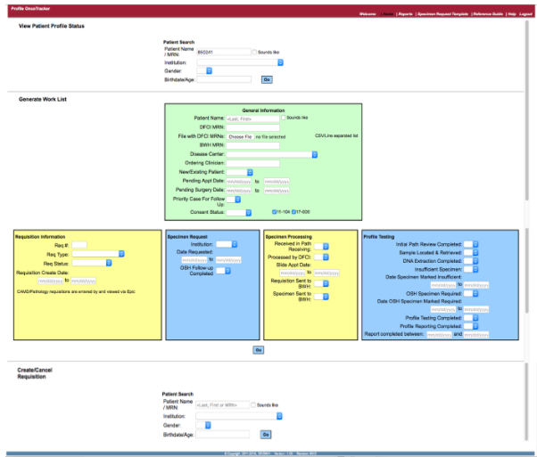
Oncologists and researchers needed a more efficient way to document and track oncology research tests, but the existing tool was outdated, cluttered, and difficult to navigate. Its unintuitive interface, redundant navigation, and excessive search options created unnecessary cognitive load and slowed researchers’ ability to find, record, and manage critical data.
Why it mattered
Researchers needed to quickly locate and track study information so they could focus on advancing research and improving patient outcomes, rather than struggling with inefficient tools and workflows.
Legacy Tool
Success Criteria
Make the app more user friendly by reorganizing existing features & workflows
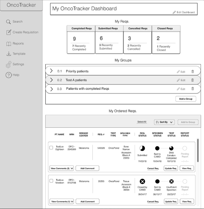
Enable users to accomplish tasks more easily through a customizable landing page
Constraints
Limited access to users
Not all target user groups were available
Stakeholder oversight & opinions
Limited access to data and contextual inquiry/ observations
Limited amount of time to develop a design concept and pitch
Discovery Research
Approach
Analyzing Workflows & User Behavior to Shape an Intuitive Design Solution
To address the operational challenges, I led a comprehensive discovery effort to understand how oncologists and researchers interacted with the existing system, where breakdowns occurred, and what they needed to work more effectively. Through a mix of user research, contextual inquiry, and technical stakeholder interviews, I identified key usability barriers and mapped opportunities to streamline workflows, reduce cognitive load, and modernize the experience.
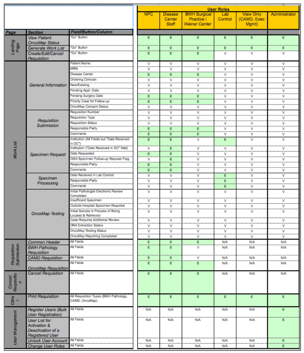
The discovery phase began with a review of previous research to establish context and identify recurring pain points. From there, I conducted contextual inquiries with researchers using the legacy tool, observing firsthand how they documented and tracked tests across multiple screens and navigation layers. These sessions revealed major friction points in functionality, layout, and workflow that contributed to inefficiency and data inconsistencies.
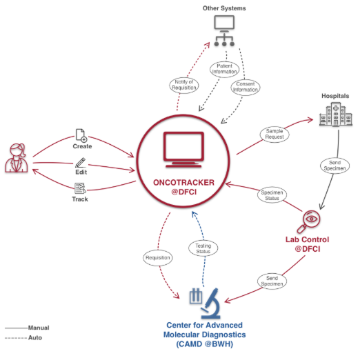
To further understand the system’s constraints, I held developer interviews to map out where and when data was entered, processed, and displayed—exposing gaps between the system’s logic and the user’s mental model. Stakeholder and user group interviews across six different teams helped clarify diverse needs, workflows, and definitions of success.
I synthesized findings by sketching process and system flows that visualized how information moved through the tool and where breakdowns occurred. Finally, I conducted user testing to validate assumptions, refine task flows, and confirm that proposed design directions improved usability and reduced cognitive load. This research-to-insight process established a shared understanding of user needs and technical realities, forming the foundation for a more intuitive and efficient design solution.
Insights
Challenges
Most search options and filters were rarely used, yet occupied significant screen space.
Users were overwhelmed by excessive data displayed at once, making it difficult to identify key information.
Frequent, repetitive clicking slowed workflows and increased frustration.
Redundant and unnecessary information cluttered screens and distracted from critical data.
Terminology (e.g., requisition statuses such as completed, missing, canceled) was unclear and inconsistent.
Navigation and layout were unintuitive—key actions (like “Requisition Order”) were placed in unexpected locations.
Suggestions for Improvement
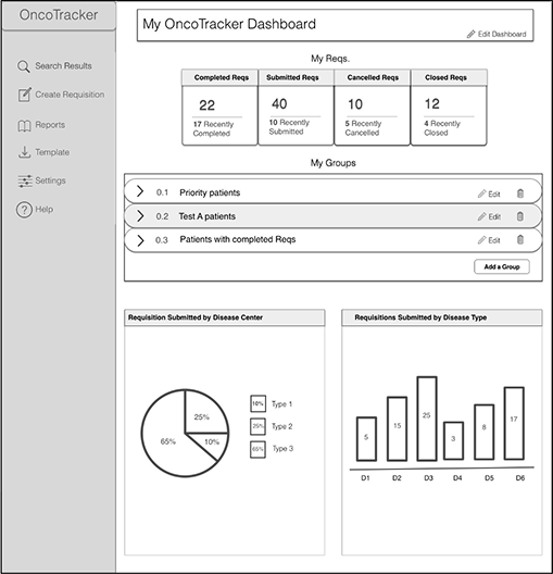
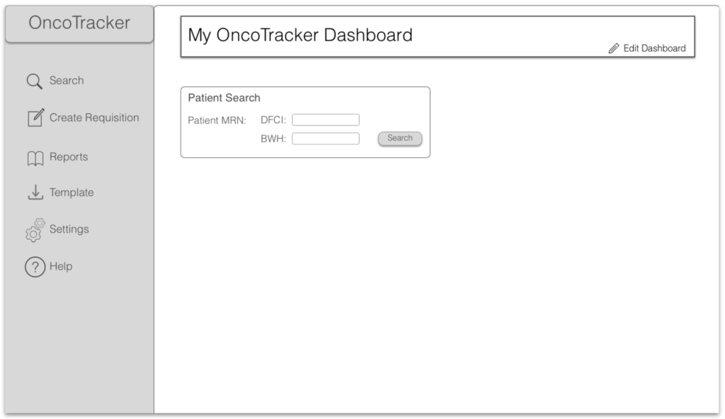
Introduce a dashboard view to provide a quick, high-level snapshot of key research data.
Implement progressive data layers so users can access detailed information only when needed.
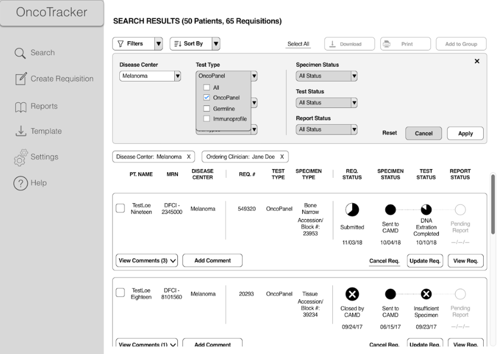
Add filtering and sorting features similar to online shopping interfaces to help narrow down key data efficiently.
Simplify navigation and reposition high-frequency actions to align with user expectations.
Clarify terminology and status definitions to reduce confusion and improve workflow comprehension.
A short project timeline constrained the depth of research and iteration possible in the initial phase.
Limited access to key user groups early in the project restricted initial understanding of all roles and use cases.
Early design assumptions had to be made based on partial insights and evolving requirements.
Some user and stakeholder needs were misaligned, requiring reconciliation of priorities.
Additional research was later needed to capture the full spectrum of user needs, pain points, and workflows.
Problem Framing
Problem Statement
OncoTracker users need an easier way to order and track OncoPanel requisitions because the current application is outdated and not very user friendly.
– “ We believe that by reorganizing the existing features on OncoTracker and incorporating the ability to personalize the landing page, we will make the app more user friendly and therefore, allow users to accomplish their tasks on the app more easily.” –
Image blurred due to releasability restrictions
Core Jobs To Be Done / Use Cases
Primary Users
CRC & Disease Center Staff
Make orders for research tests, comment on specimens track testing progress & view results
Secondary & Tertiary Users
Surgical , Lab Control, CAMD, Steakholder & Admin
Stakeholders: are looking at aggregate data & numbers
Lab Control: is searching and making comments about a specimen for quality control
CAMD: is looking at reqs and comments to begin testing process
Surgical: Receives requests & follows up on specimen abstraction & scheduled dates
Design Objectives
Support requisitions for three distinct test types within a unified workflow.
Enable flexible search with customizable parameters to accommodate varied user needs.
Introduce grouping and filtering options to streamline data exploration and comparison.
Make key information easily scannable across requisitions, specimens, tests, and reports.
Clearly display patient details, disease center, ordering user, and specimen type within a single view.
Design Strategy & Exploration
Users Groups
0
Interviews
0+
Usability Tests
0+
Iterative User Testing
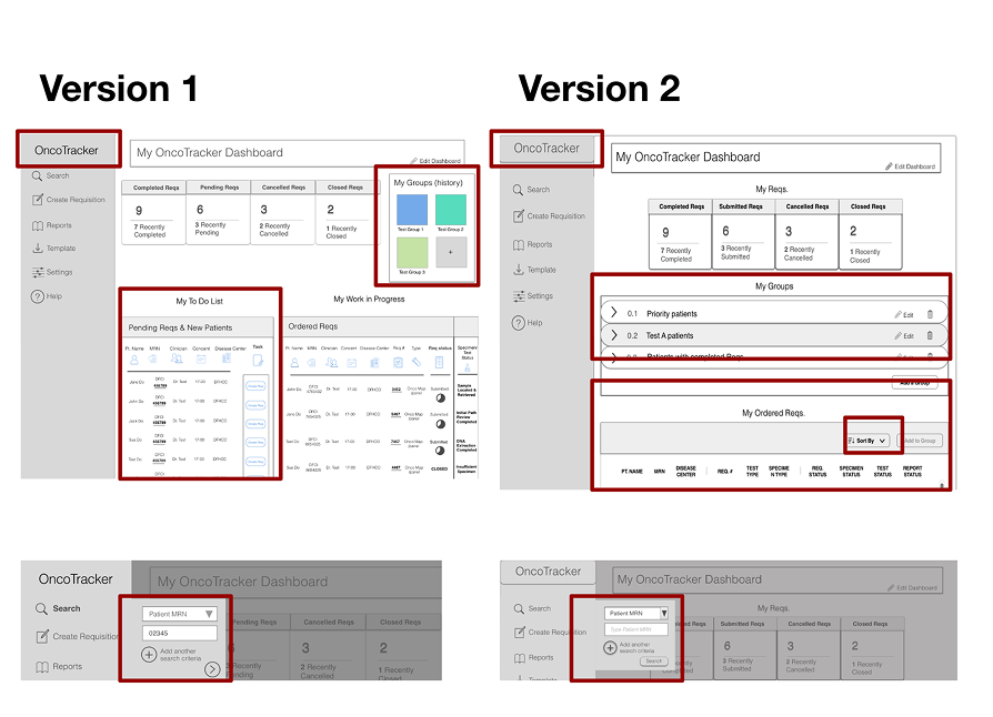
“I don’t know how to go back the homepage” “I like my groups but the area is crowded” “I don’t have access to a list of pending reqs.” “I like the multi-patient view” “I’d like to “sort by” my search” “I was expecting a search button”
Highlighted the Oncotracker logo to make more clear how to go back to the landing page, cleaned up the distracting layout of the groups, got rid off one of the widgets we initially had included since users didn't need it. We changed the list view to be consistent with the multi-patient view.
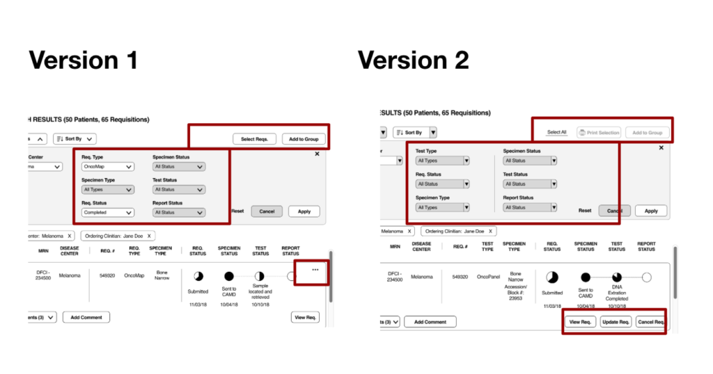
“I need to print results” “Localize the filters criteria takes me time” “Select reqs. & Add to group are confusing” “Cancel and update are hidden”
Added a print requisition functionality, arranged the filters to give more importance to the main filters criteria and clarified the selection of requisitions
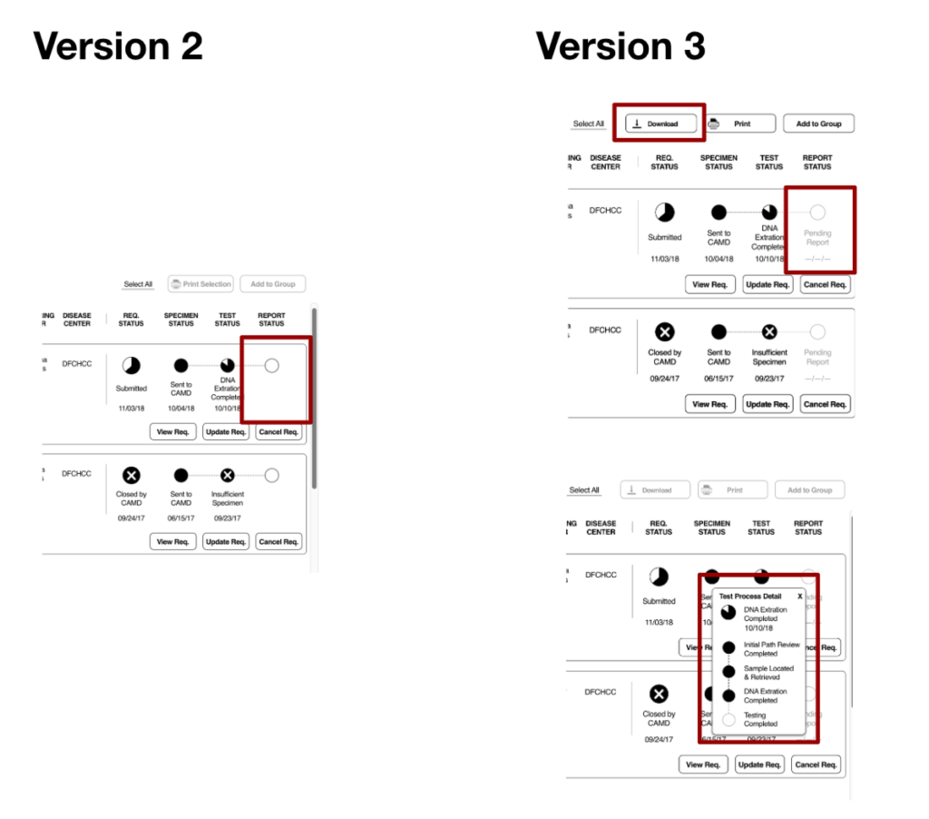
“New users need more context of the processes” “I need to download the search” “I get confused when there is no status”
Added more context of the different statuses
“I want meaningful statuses”
“I want to know the dates along the testing process to know when reports will be ready"
“I would like better communication between ordering user and CAMD, some way to leave comments in the application"
“I need an efficient layout & structure to order and view Reqs.”
- User "I" Statements
UI Designs
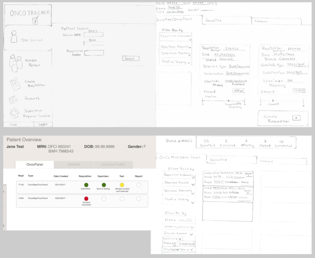
I redesigned an outdated application to streamline workflows and reduce cognitive load, helping users focus on the data and searches most relevant to their needs. The new design unified three distinct test types into a single workflow, introduced flexible search with customizable parameters, and added grouping and filtering to simplify data comparison. Key patient and specimen details were consolidated into one clear, scannable view—improving efficiency, clarity, and user confidence. Due to a tight timeline, the designs were developed at a low-fidelity level to quickly iterate and validate concepts.
Design Contribution &
Collaboration
Design
Led end to end UX design & Steakholder alignment
Delivered low-fidelity UI & prototypes
Facilitated user interviews & testing
Collaboration
Worked with engineering and Product owner to determine stories and deliver product updates
Worked with users to validate workflows & UI testing
Created a platform for user feedback from groups that previously had limited input opportunities.
Uncovered valuable insights into how the system could be modernized and tailored to meet distinct user group needs rather than relying on a one-size-fits-all approach.
Challenges
Limited access to key user groups early in the project restricted initial understanding of all roles and use cases.
Some user and stakeholder needs were misaligned, requiring reconciliation of priorities.
Early design assumptions had to be made based on partial insights and evolving requirements.
Additional research was later needed to capture the full spectrum of user needs, pain points, and workflows.
A short project timeline constrained the depth of research and iteration possible in the initial phase.
What we would do different
Align on primary user needs and shared priorities with stakeholders earlier in the process.
Incorporate additional feedback channels—such as surveys or asynchronous sessions—to broaden user input.
Engage all user groups early to capture diverse needs and reduce upfront assumptions that could lead to rework later in development.
Leadership Insight
This project reinforced the importance of leading with alignment—ensuring that user needs, stakeholder goals, and technical constraints are understood early and revisited often. By fostering open feedback loops and adapting research strategies midstream, I helped the team stay focused on evidence-based decisions while building trust across diverse roles.